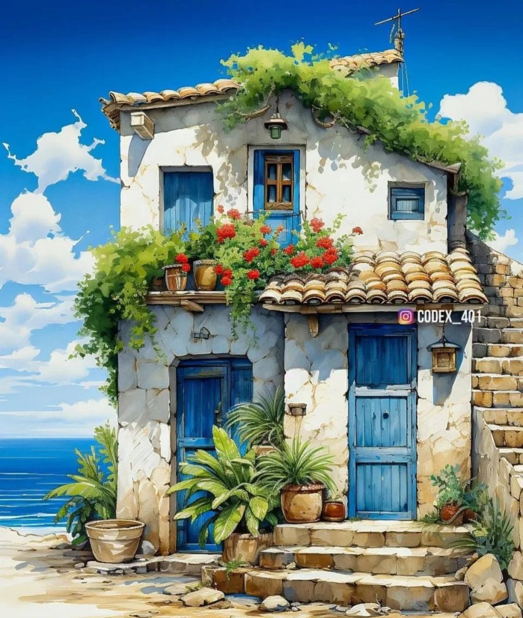
If you’re a watercolour lover like me, you know that there’s nothing quite as mesmerizing as watching vibrant colors blend and flow on paper. Naturally, the hues of watercolour paints can tend to be softer as you thin the colours with water, so what can you do if you want to achieve really bright and vibrant hues?
As an artist who has spent countless hours experimenting and perfecting the craft, I’m excited to share some of my favorite tips for achieving those vibrant, eye-popping, lively colours in your watercolour paintings.
Whether you’re a beginner or a seasoned artist, these techniques are sure to elevate your watercolour game and make your artwork stand out.
This post contains affiliate links. As an Amazon associate, I earn for qualifying purchases.
Use High Quality Paints
Firstly, to achieve the best, most vibrant colours of watercolour pigment, it’s important to invest in high-quality paints. While it may be tempting to buy the cheapest set you can find, the quality of the pigments will greatly impact the vibrancy of your colours.
High-quality, artist-grade watercolour paints will offer intense and saturated colours. Look for paints with a high pigment load and good lightfastness ratings.
What is a lightfastness rating in watercolour?
A lightfastness rating is a measure of how resistant a colour or pigment is to fading or changing when exposed to light over time. This will allow you to see how well vibrant paintings will retain their colour. In regards to art materials, lightfastness ratings provide information about the long-term stability of colours in different conditions of light exposure.
Here are some reputable watercolour paint brands known for their high-quality pigments and strong lightfastness ratings:
Winsor & Newton Professional Watercolours
This brand is renowned for its professional-grade watercolours that offer a wide range of vibrant colours with excellent lightfastness. They provide clear information about the lightfastness of each colour, allowing you to make informed choices for your artwork.

Daniel Smith Watercolors
Daniel Smith is well-regarded for its vast selection of colours, many of which have superior lightfastness ratings. Their paints are known for their intensity and consistency, making them a favorite among many watercolour artists.

Holbein Artists’ Watercolors
Holbein offers a range of high-quality watercolours with strong lightfastness. Their pigments are finely ground, resulting in smooth and vibrant colours that remain true over time.

M. Graham Watercolors
M. Graham is celebrated for using honey as a binder in their watercolours, which contributes to the paint’s creamy consistency and enhanced lightfastness. Their colours are vibrant and maintain their brilliance on the paper.

Schmincke Horadam Aquarell Watercolors
Schmincke is known for its premium watercolors that offer exceptional lightfastness and color brilliance. Their wide range of colours includes both traditional and modern shades.

Sennelier La Petite Aquarelle Watercolors
Sennelier is known for its high-quality watercolors, and their La Petite Aquarelle line offers both quality and affordability. Many colours in this range have good lightfastness ratings, making them suitable for vibrant artworks.

Paper for Vibrant Watercolours
Next, consider your paper choice. The texture and absorbency of the paper will impact how the paint sits on the surface and how the colours appear. A rough paper will create a more textured, organic look, while a smoother paper (like a hot pressed paper) will allow for more precise, detailed work.
However, be sure to choose a paper that is specifically designed for watercolour, as regular paper will not hold up to the moisture.
Select Lightfast Colours
Below is a list of colours that provide excellent lightfastness and vibrancy, time and time again.
Cadmium red is a powerful and vibrant red color that adds a bold and striking element to your artwork. Look for variations like Cadmium Red Medium or Cadmium Red Deep, which offer both vibrancy and good lightfastness.
Cadmium yellow is a vivid and warm yellow hue that can bring energy and brightness to your paintings. Cadmium Yellow Medium or Cadmium Yellow Deep are popular choices with strong lightfastness.
Cobalt blue is a brilliant and calming blue color that works well for creating serene skies and water scenes. Cobalt Blue is often praised for its vibrancy and lightfastness.
Quinacridone Magenta is a stunning, intense pinkish-red color that adds drama and depth to your paintings. Many brands offer Quinacridone Magenta with good lightfastness.
Phthalo Green is a vibrant, cool green color that can add a lively and fresh touch to your artwork. Phthalo Green (Blue Shade) is often chosen for its brightness and lightfastness.
Indian Yellow is a warm, golden yellow hue that can bring a sense of warmth and richness to your paintings. Look for versions with strong lightfastness to ensure your colors last.
Quinacridone Gold is a versatile color that offers a range of warm, golden tones. It can be used for a variety of subjects and adds vibrancy to your artwork.
Permanent Rose is a vibrant and intense rose color that can create stunning floral and expressive effects. Look for this color with high lightfastness to preserve its brilliance.
Ultramarine Blue is a classic blue color that can be used to create both deep shadows and bright skies. Look for Ultramarine Blue with good lightfastness for lasting vibrancy.
Hansa Yellow is a bright and clear yellow color that can add a cheerful and energetic element to your paintings. Choose versions with strong lightfastness to ensure longevity.
When choosing specific colors, always check the lightfastness rating provided by the manufacturer. The ratings are usually indicated using a scale or symbols, such as ASTM ratings or stars. A higher rating or more stars typically indicates better lightfastness.
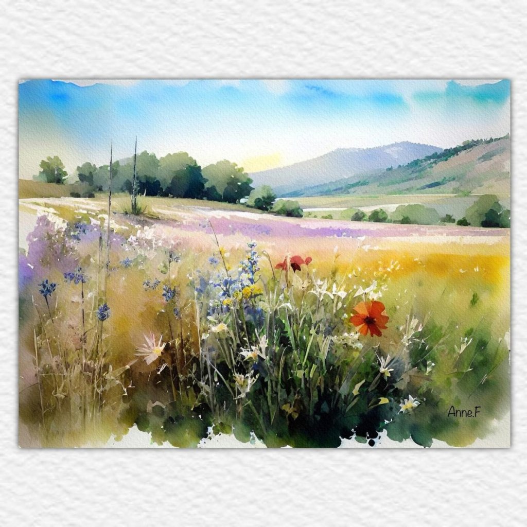
Layer your Colours
Another important factor in achieving vibrant colours is layering. Instead of trying to mix your colours to the perfect shade in one go, consider building up your colors through multiple layers. This will create depth and richness in your painting.
Start with a light wash of your base color, and then gradually layer on more pigment, allowing each layer to dry completely before adding the next. This will prevent the colors from becoming muddy and ensure that each layer stays vibrant.
Try Concentrated Watercolour Ink
Have you heard of concentrated watercolours? They come in a jar with a dropper and are incredible for achieving super vibrant colours, much like ink.
These colours can also be used in methods like airbrushing and are perfect for illustration as they are dye-based.
The most popular choice by artists are the Dr. Ph. Martin’s Radiant Concentrated Water Colours. You simply use these out of the bottle instead of adding water to the mixture and can use them with a pen, airbrush, or paint brush.

Use Whitespace
By strategically incorporating white space, you can enhance the vibrancy, balance, and overall impact of your watercolour paintings.
Why? White space allows the viewer’s eyes to rest and provides a sense of balance within the painting. It prevents the artwork from feeling overwhelming and gives the viewer a chance to appreciate the colours and details without distraction.
White space also creates a strong contrast against your painted areas, making the colours appear even more vibrant and intense. The juxtaposition of bold, saturated colors against pristine white can draw the viewer’s eye to specific focal points, emphasizing key elements of your composition.
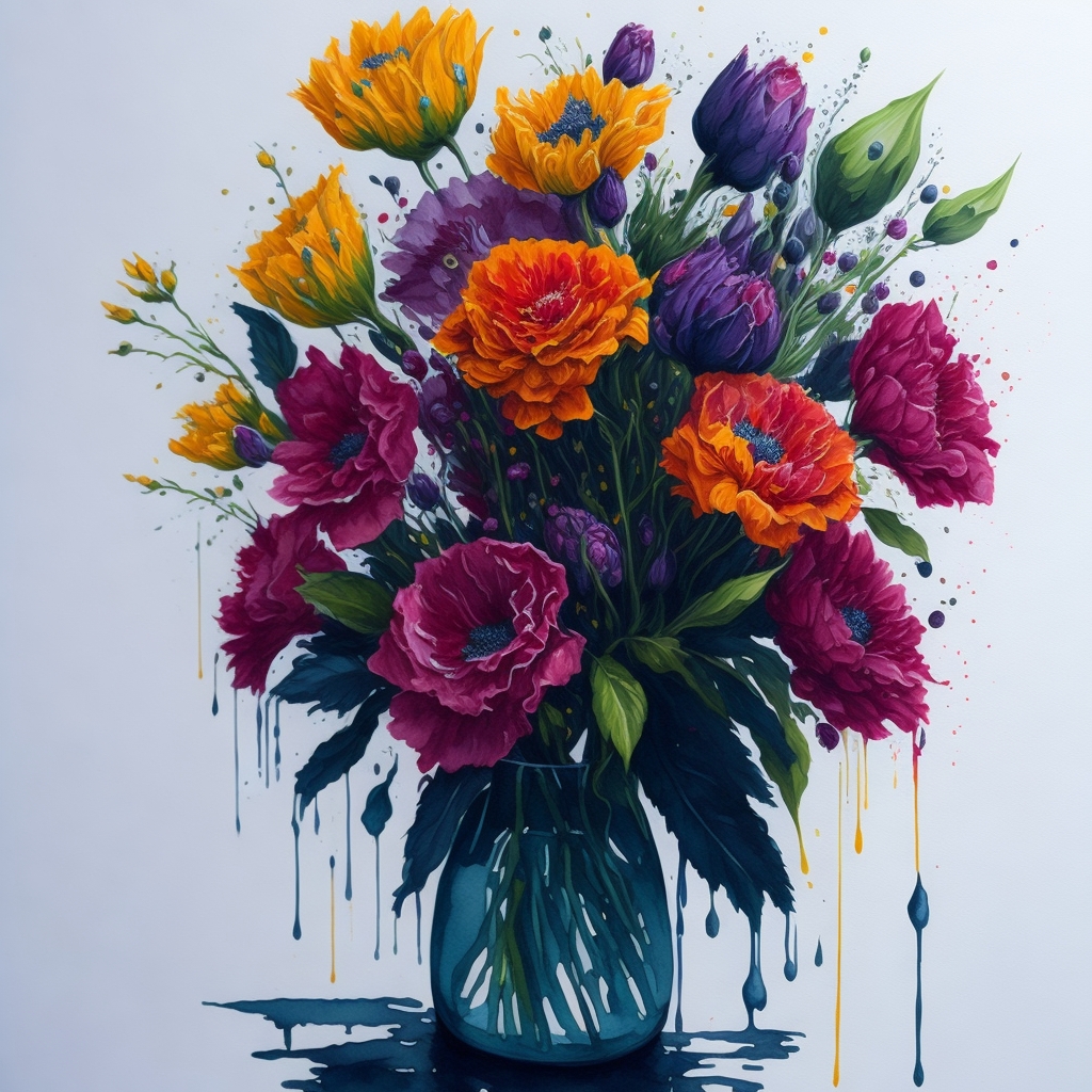
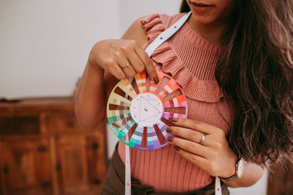
Choose Complementary Colours
Finally, consider using complementary colours to enhance the vibrancy of your hues. Complementary colours are the colours that sit opposite each other on the colour wheel, such as red and green, blue and orange, and yellow and purple. When placed next to each other, complementary colours create a visual contrast that can make each colour appear more vibrant.
Achieving vibrant colours in your watercolor paintings requires high-quality materials, careful layering, and a willingness to experiment. By incorporating these tips into your painting practice, you’ll be well on your way to creating stunning, eye-catching works of art.
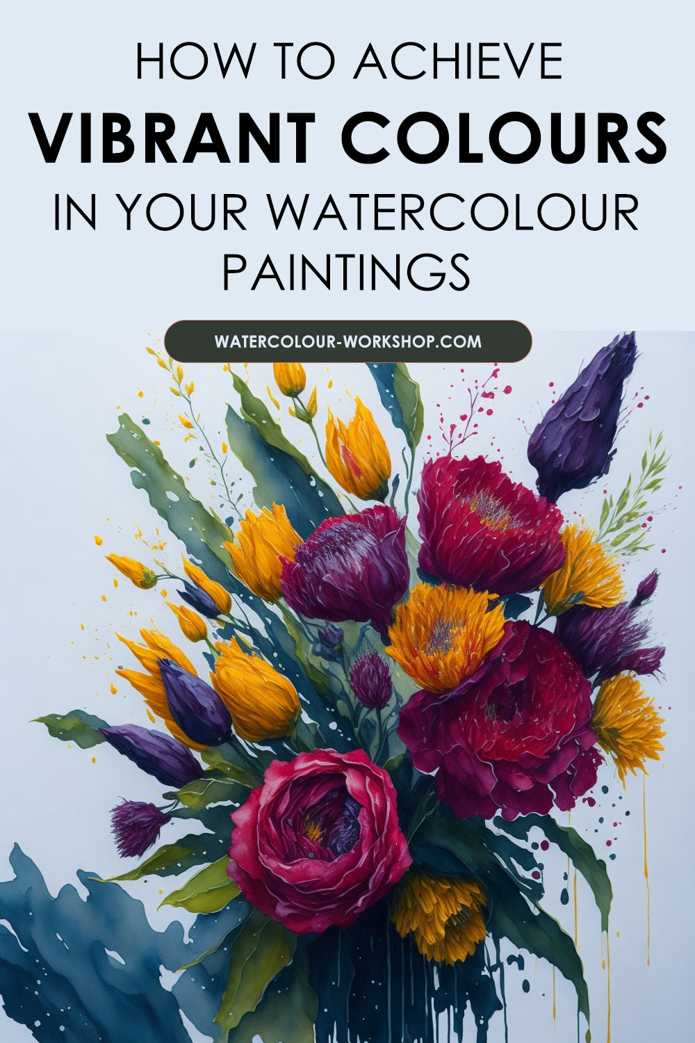
Pin this for later:

Besides being a wife and mama, I’m an entrepreneur, artist and author of the Watercolor With Me book series. I’m from Ontario, Canada and founder of the brand Wonder Forest. I’m here to help you on your watercolour journey!